Pie Chart: Pie Chart is a drawing of different types of data in a 360-degree Circular shape where we can visualize the data. It is mainly used when our type of data is very less. In a pie chart different colored slices are created for each type of data.
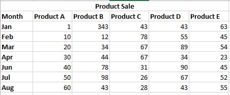
In Excel creating Pai Chart is very easy, let us see how to create a pie chart for given data in excel. First, let us create an excel sheet of product sales monthly
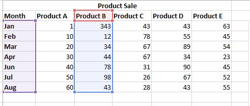
Step 1: Select the month column and one of the products below. Here we have selected the month and column of product B.
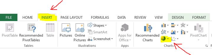
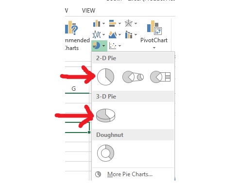
Step 2: Now go to the insert tab and under the chart, section clicks on the pie chart button.
After clicking on the pie chart we can see options for the 2D pie chart and 3D pie chart. Click on the one you want.
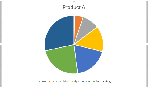
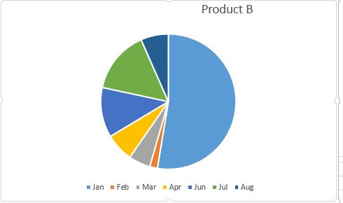
Output: So finally we can see our pie chart has been created successfully for Product B
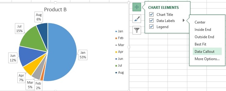
Formating and other options: Click anywhere on the chart then a + (plus) button appears on the right side where various chart elements like title label legend are given
Under Data Label we can label each graphic slice which enhances clarity, percentage of each slice is shown when we choose the data callout option. Look at the picture below
.jpeg)